 While heat maps are powerful tools for creating marketing strategies that boost sales; the truth is that their applications go beyond and benefit other sensitive areas of companies.
Based on the principle that heat maps help us to precisely know which areas of your web pages provide the greatest impact on users; the resulting analysis yields valuable clues about the areas of greatest demand on our websites.
From this first-hand knowledge we positively strengthen our marketing strategies. However, the basic principles of heat maps also have wider uses: They help; for example, to detect which areas of our companies are most exposed to risks.
But before delving into the alternative uses of heat maps and their usefulness to other areas of the company, it is good to know how they work.
Principles of Heat Maps
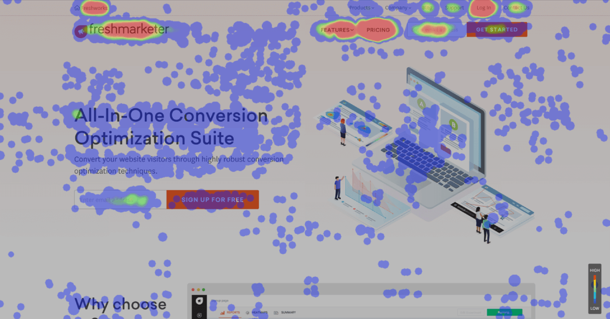
Thermography is the main principle behind heat maps. It employs a hierarchy based in easy-to-understand color coding to show interesting data. So, according to the concurrence of tones (red, orange and yellow for warm; and green, blue and turquoise for cold) you will determine the most visited areas in your website, and the less interesting areas for your visitors.
Heat Maps, the Waterline and the Golden Triangle
Now the heat maps the waterline is an imaginary line below which the page content is visible only when you lower down the page with the scroll wheel or scroll bar.
Google Analytics is the best known example of heat map. Their studies reveal that users focus their attention mainly on the upper left of the page, which they call the golden triangle.
This is the ideal location for online advertisers… and also for those interested in locating vulnerabilities and security gaps in your sites.
Types of Heat Maps
Regarding the marketing area, there are three types of heat maps:
- Click maps: They show the areas and elements where clicks are most frequently used.
- Mouse Clicking Activity: They represent all the actions of the cursor. Some expert also call them attention maps.
- Scrolling maps: Thanks to the tracking of displacement you appreciate the places where the user moves the mouse and how far it reaches below the waterline to discover the content.
Now, there are also other heat maps that use the same principles of thermography to generate useful patterns in Risk Management and Disaster Recovery; Asset Management and even; Information management.
Applications of Heat Maps in Marketing
 The main function of these tools is to quickly detect the user’s journey on our websites, and their interaction with the elements that compose them.
Thanks to a system of colors for the click mapping, it is immediately appreciated what is correctly working and what is not within our web pages. It does not require a great specialization in statistics to analyze the reports of data coming from the web.
We use Heat maps in Marketing to:
1. Locate users
Through them, we know where the users spend more time in our web pages; and thus, knowing what are the less popular articles for them.
2. Find sites for improvement and malfunctions
Help to detect and visualize the sites where the user clicks, but is not enabled for that function and vice versa. The constant use of the search engine serves as an indicator that the page is not clear enough for visitors.
3. Analyzing the user’s behavior
They throw movement patterns within the different medias. For example, detecting if the “Call to Action” (CTA) buttons on mobile screens are too small to be clicked easily.
4. Compare user behavior
Performs a comparison of the routes that new users take in comparison to those who already are regular visitors of our web pages.
5. Analyze navigation routes
It helps us to know what visitors do from emails; social networks and those links that have sponsors, etc. Heat maps makes easier obtaining and displaying crucial information about the behavior of Internet users.
So, when you know your visitor’s habits on your web pages, you get the necessary data to improve their browsing experience. This results in the increasing of the time they spend on them; which also increases the possibility that they prefer your product and service proposals.
However, heat maps indicate only a tendency of your users to use your website, but do not indicate why. Then, you need other web analysis tools to compare them, and thus determining your strategies to improve the user experience.
It is good to remember that the way users perceive our web pages changes constantly. Knowing how they move within our pages achieve the impact we want to establish better and more powerful loyalty strategies.
Other uses of Heat Maps
 Risk Maps
Heat maps also help to detect risks and allow us to appreciate the data linked to the most common risks that each organization faces. These maps also help to recognize and prioritize their associated risks.
Likewise, risk heat maps are a determining factor for business risk management because they help to organize the work plan based on priorities.
Last; heat maps also allow the visualization of the degree of risk by colors. Through them, we know the most common risks that the companies are exposed to based on these factors of occurrence: Probability; frequency; gravity; impact; affected areas; etc. Like this we achieve a fairly complete plan for risk prioritization with their associated types and solutions.
Creation of Risk Maps from Heat Maps
In the first instance, the risks that our companies are exposed to are mainly divided into strategic; operational; compliance; financial and reputational risks.
However, risks are broader and each company can have its own list of them depending on the particular causes that affect them financially. Likewise, such a list must be directly associated to the internal and external events that enhance them; and also to the possible control processes to correctly mitigate them.
Finally, as threats and vulnerabilities evolve; so heat maps and risk maps keep their pace. Consequently, it is good to periodically look at the risk maps based upon heat maps; and adjust them all to the associated contingency plans to ensure that they are being effectively managed.
Heat maps to improve wireless network performance
 Network performance is another aspect that benefits from heat maps. Through them, you can detect areas with better and worse network performance. Also, with heat maps you can detect the peaks of wireless signal strength and from them, making adjustments and improve wireless coverage with ease.
Making heat maps to improve the performance of wireless networks starts with an inventory of mobile devices connected to the network in the immediate vicinity; and the signal readings they throw as distances gradually increase.
With this information, we obtain a physical map based on thermography that indicates the intensity of the signal. Like this, we can improve the physical architecture of the network to correctly distribute the wireless signal to all the important and necessary assets and devices within the company’s facilities.
Heat maps for the Control of assets
Finally and analogously to the use of heat maps to improve the performance of wireless networks; heat maps for asset control are also very useful to control our inventories.
Through them we have a comprehensive view of our goods and assets with greater and less mobility in our inventories; and this can be extended to our tangible and intangible assets. And these readings are perfectly compatible with other management tools that complement the panorama.
At GB Advisors we have powerful tools based on Heat Maps that help you to better understand the behavior of your users; and strengthen the protection and security of your tangible and intangible assets. Find out more and better uses of your applications to increase the visibility and profitability of your business. Leave your information here to discuss your possibilities.


